UX Case Study · GWU Thesis 2025–2026
SAGE
Beyond the Red Lines
SAGE is a mobile financial empowerment platform designed for residents in Washington, D.C.’s Ward 7 and Ward 8, where banking deserts, distrust in financial institutions, and predatory lending create barriers to safe financial access.
The project explores how a mobile product can help underbanked residents find trusted local resources, learn financial concepts without shame, track progress, and access safer microloan options through community-based support. Developed as a two-semester UX thesis at George Washington University, combining systems mapping, primary and secondary research, resident conversations, competitive analysis, and mobile product design.
Project Snapshot
A thesis project rooted in
lived experience and real data.
SAGE started as a question I couldn’t stop asking: why does financial technology consistently ignore the communities that need it most? Ward 7 and Ward 8 in Washington D.C. have some of the lowest banking access rates in the country, despite being minutes from the nation’s financial center.
I spent two semesters mapping the systems that create financial exclusion, talking to residents, and designing a platform that treats trust as infrastructure. SAGE is not just an app. It is a design argument: that access and dignity are not mutually exclusive.
The Problem
The red lines still hold.
Residents in Ward 7 and Ward 8 are not just missing financial apps. They are navigating a system shaped by banking deserts, limited local financial services, high-fee alternatives, and long-term distrust toward institutions.
Design challenge
Not: "How might we make another fintech app?"
"How might we design a financial tool that feels trustworthy, understandable, and useful for people who have been repeatedly excluded from traditional banking?"
Redlining was officially banned in 1968. But in Ward 7 and Ward 8, its effects never left. These are neighborhoods where a bank branch is harder to find than a payday lender, where a credit score determines more than a person’s ambition ever will.
Ward 7 and 8 have significantly fewer bank branches per capita than any other D.C. ward, classified as banking deserts by federal standards.
Payday lenders and check-cashing services cluster in these wards, charging effective APRs that trap residents in cycles of debt.
Residents expressed deep distrust of financial institutions, shaped by generations of denial, exploitation, and broken promises.
Design Principles
The values every screen had to answer to.
Simplicity over sophistication
Every screen should work for someone with limited smartphone experience and little reason to trust a new app. I removed every element that did not serve a direct user need. Cognitive overhead is not a small inconvenience here. It is a barrier to financial access.
Community over individualism
Financial tools have historically isolated users. SAGE centers peer connection, shared knowledge, and collective progress at every touchpoint.
Transparency over complexity
No hidden fees. No opaque processes. Every action in SAGE explains itself, because clarity is respect, and these users have been lied to before.
Progress over perfection
Small wins compound. SAGE celebrates incremental financial progress rather than setting distant, abstract goals that feel impossible from the start.
Research Approach
Starting with what’s broken,
not what’s missing.
Research combined 10 qualitative interviews, secondary data sources, competitive analysis, and systems mapping to understand the full landscape before any design work started.
10 qualitative interviews with Ward 7 and 8 residents exploring lived financial experiences, trust, and barriers.
Government and public data from FDIC, DC Government, Bank On DC, DC BizCAP, DC REACH, academic sources, and journalism.
Benchmarked Cash App, Chime, SoFi, Khan Academy, Zogo, Mission Asset Fund, MoCaFi, local credit unions, and DC financial initiatives.
Research Methods
Purpose: Understand financial access barriers in Wards 7 & 8.
Revealed: Residents face banking deserts, branch closures, transportation barriers, and greater reliance on alternative financial services.
Purpose: Evaluate existing fintech, literacy, and community banking solutions.
Revealed: Most platforms focus on transactions and budgeting, but few address trust, local resources, and community support.
Purpose: Understand relationships between residents, lenders, banks, nonprofits, and government programs.
Revealed: Financial exclusion is influenced by interconnected social, economic, and institutional factors rather than a single problem.
Purpose: Identify key groups involved in financial access.
Revealed: Residents, nonprofits, credit unions, community organizations, and financial educators all play important roles in support networks.
Purpose: Learn about lived experiences and perceptions of financial services.
Revealed: Trust, accessibility, and clear guidance were more important than advanced financial tools.
Purpose: Explore existing research on financial literacy and banking access.
Revealed: Financial education is most effective when paired with actionable resources and ongoing support.
Purpose: Synthesize research findings into design opportunities.
Revealed: Users needed trusted guidance, simplified learning, local resources, and achievable financial goals.
Early Ideation Sketches
Early ideation sketches: exploring interaction models and information flows before moving to digital tools. Drag or scroll to see all sketches.
Research & Design Team
Documentation from community engagement, research sessions, and the design process behind SAGE.
Key Insights
Three truths that shaped every decision.
Trust is infrastructure.
Financial apps fail in Ward 7 and 8 not because of missing features, but because institutions burned trust for decades. Every design decision had to answer: why would someone believe this?
Instead of focusing only on financial tools, SAGE puts trust first through clear language, local resources, and community-based support that feels approachable and familiar.
Complexity is a barrier.
Dense financial language and multi-step onboarding excludes the people who need financial tools most. Simplicity is not a design preference here. It is a prerequisite for access.
Financial topics were broken into simple lessons, guided steps, and easy-to-understand actions so users can learn without feeling overwhelmed.
Community is the platform.
Peer networks are the primary mechanism for economic mobility in Ward 7 and 8. Residents already help each other with money. The right design amplifies that, rather than replacing it with an institution.
SAGE connects users to local organizations, events, and support networks because financial growth is often easier when people do not have to navigate it alone.
User Journey / Core Flow
From research to product experience.
Research showed that residents needed more than financial tools. They needed trusted guidance, accessible learning, local support, and clear next steps. To turn those needs into a product experience, the platform was designed around a simple journey: learn, connect, take action, and track progress.
User journey map showing how residents move through the SAGE platform across key touchpoints.
Core user needs driving this flow
A place that feels safe and familiar, not institutional.
Financial concepts explained simply, without shame.
Real connections to nearby organizations and resources.
Always know what to do next without feeling lost.
Designing the Experience
Turning research into solutions.
Each feature maps directly to a research finding. The design decisions were not about adding tools. They were about removing barriers.
Feature 01
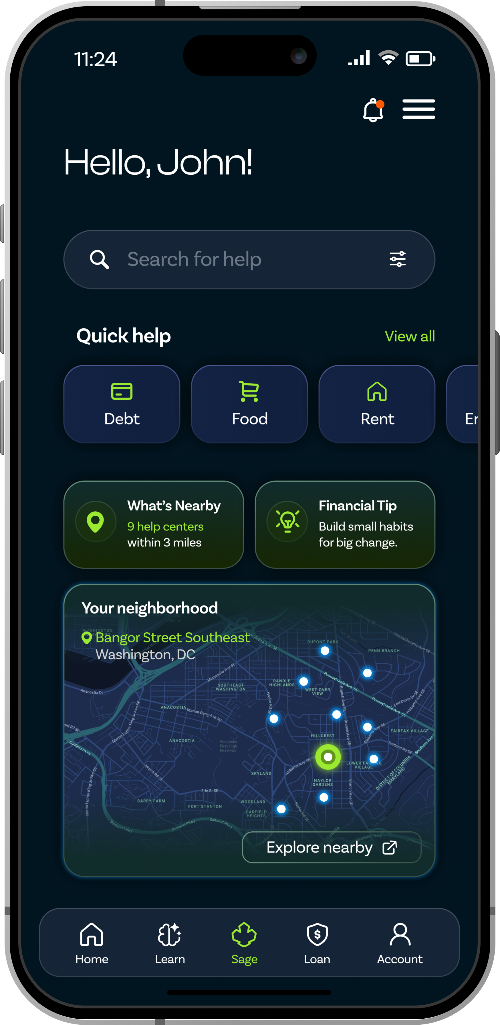
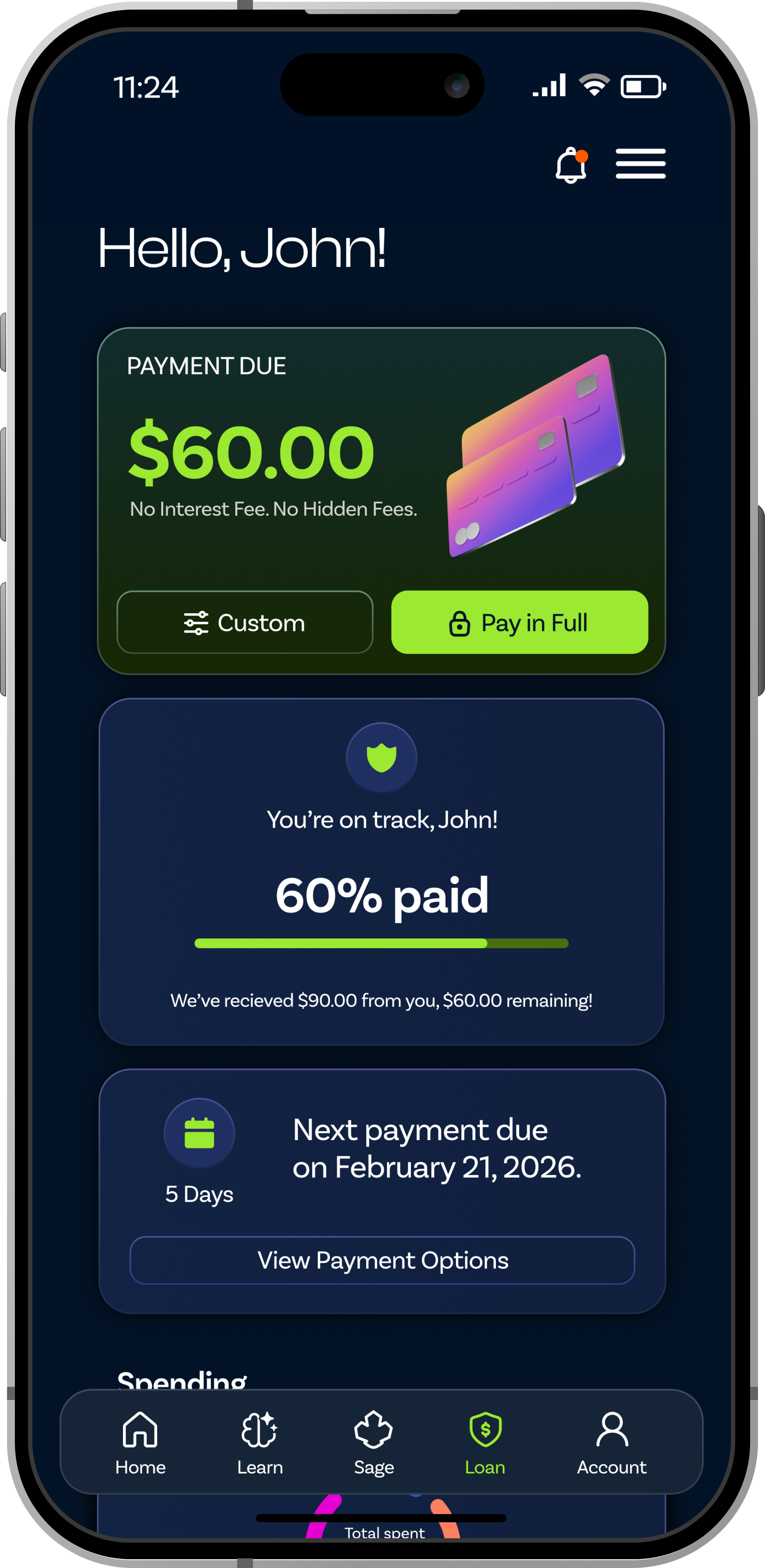
Dashboard
One clear place to see what matters right now.
Users need one clear place to see what matters right now: payments, goals, lessons, and local support.
The dashboard brings these pieces together into simple cards, so users can quickly understand what needs attention and where to go next.
Instead of making users search through different sections, the dashboard gives them a calm starting point and helps them keep moving forward.
Screens shown: Dashboard overview, financial goals, learning progress, resource recommendations, upcoming payments.

Feature 02
Community Hub
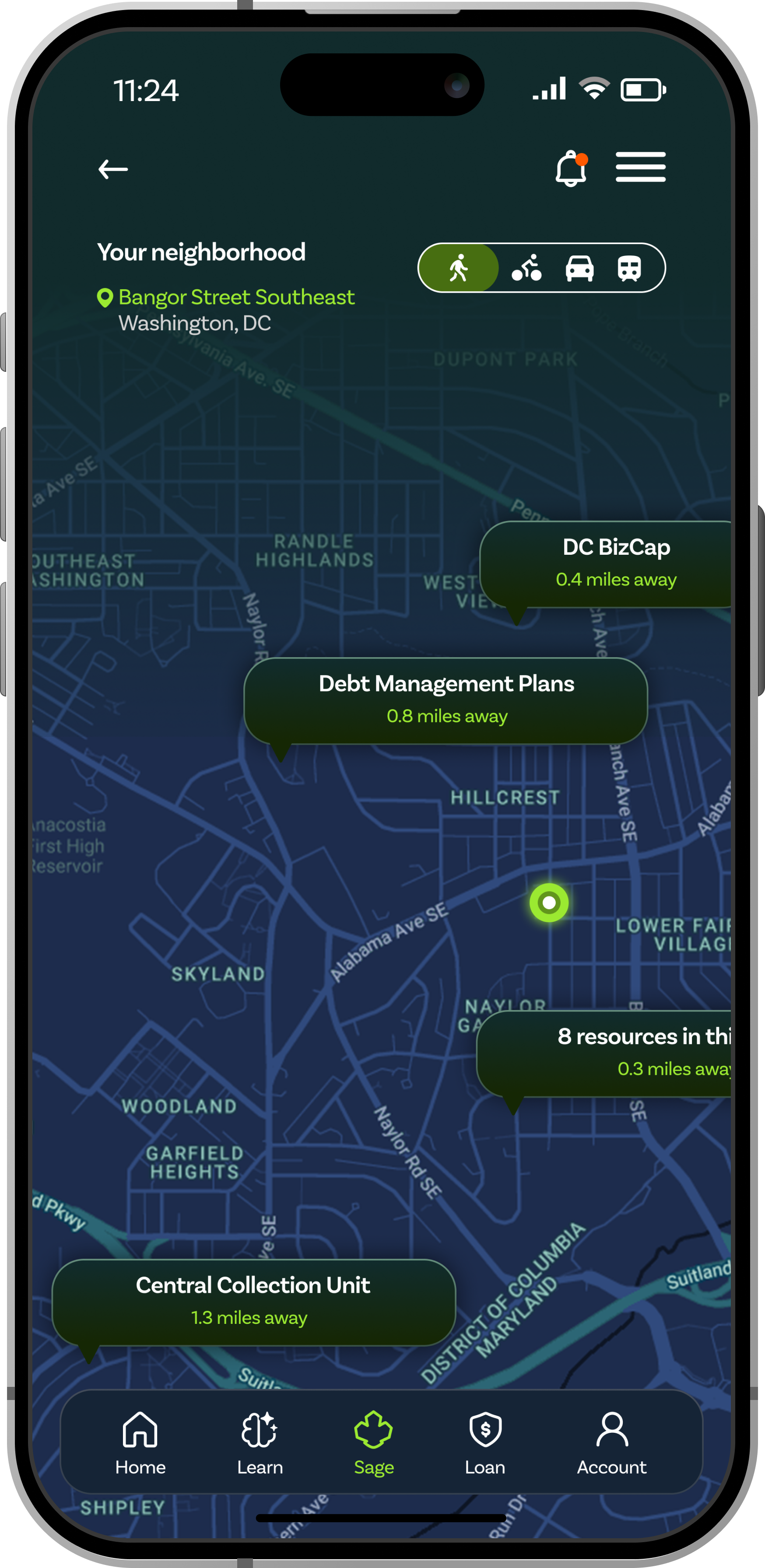
Trust built through community, not institutions.
Residents need trusted places to find support, ask questions, and discover local financial resources.
The Community Hub brings together local organizations, workshops, events, and support networks in one place.
Financial growth often happens through trusted relationships and community support, not just digital tools.
Screens shown: Community feed, local events, resource directory, map-based support.
Feature 03
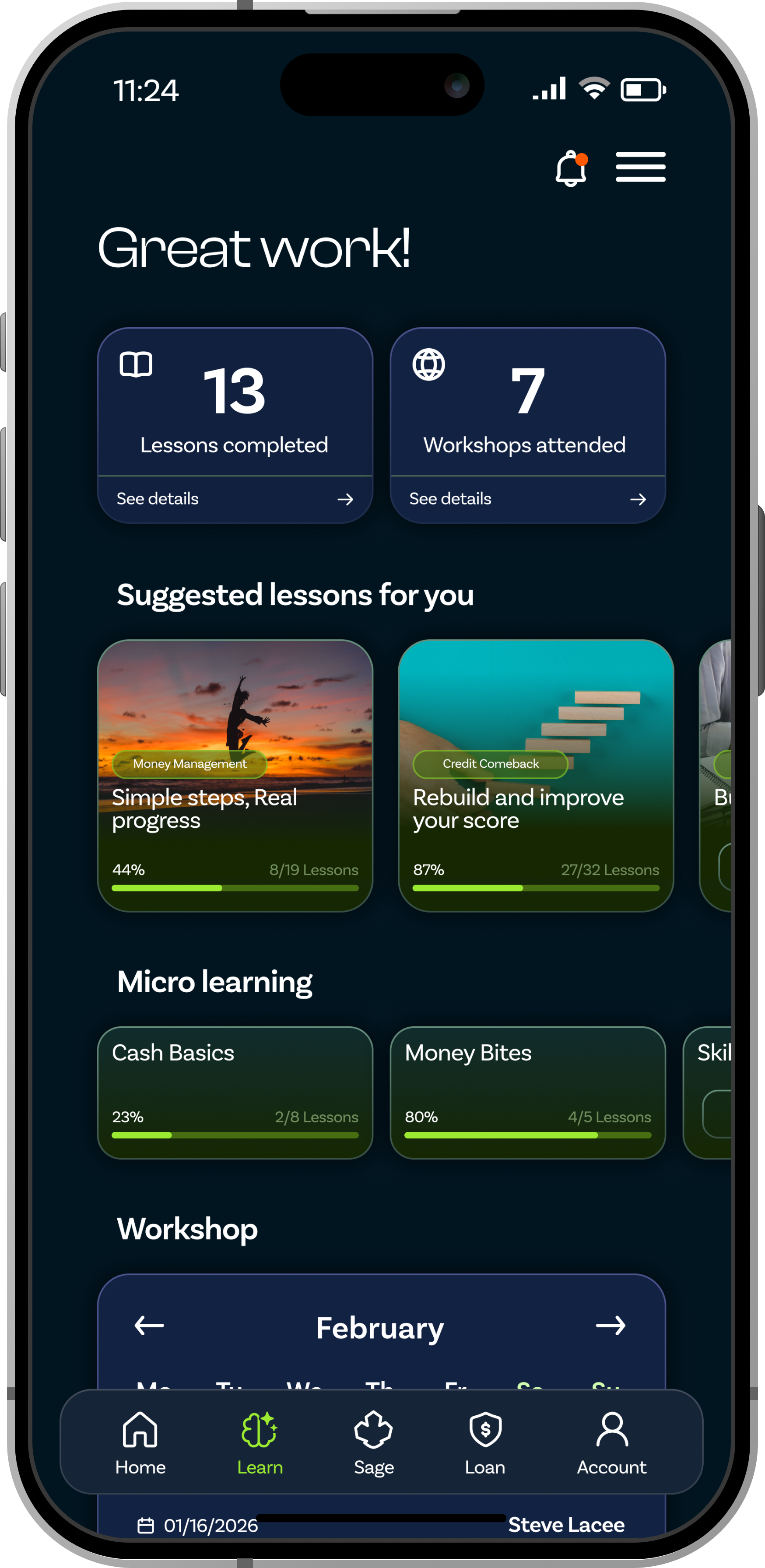
Financial Lessons
Bite-sized education. No jargon. No shame.
Residents need financial education that feels clear, short, and nonjudgmental to help inform decisions.
Lessons are broken into bite-sized cards with plain-language explanations and progress tracking.
This reduces shame and increases confidence, making financial learning feel attainable.
Screens shown: Lesson library, lesson details, progress tracking, workshops.

Feature 04
Microloan
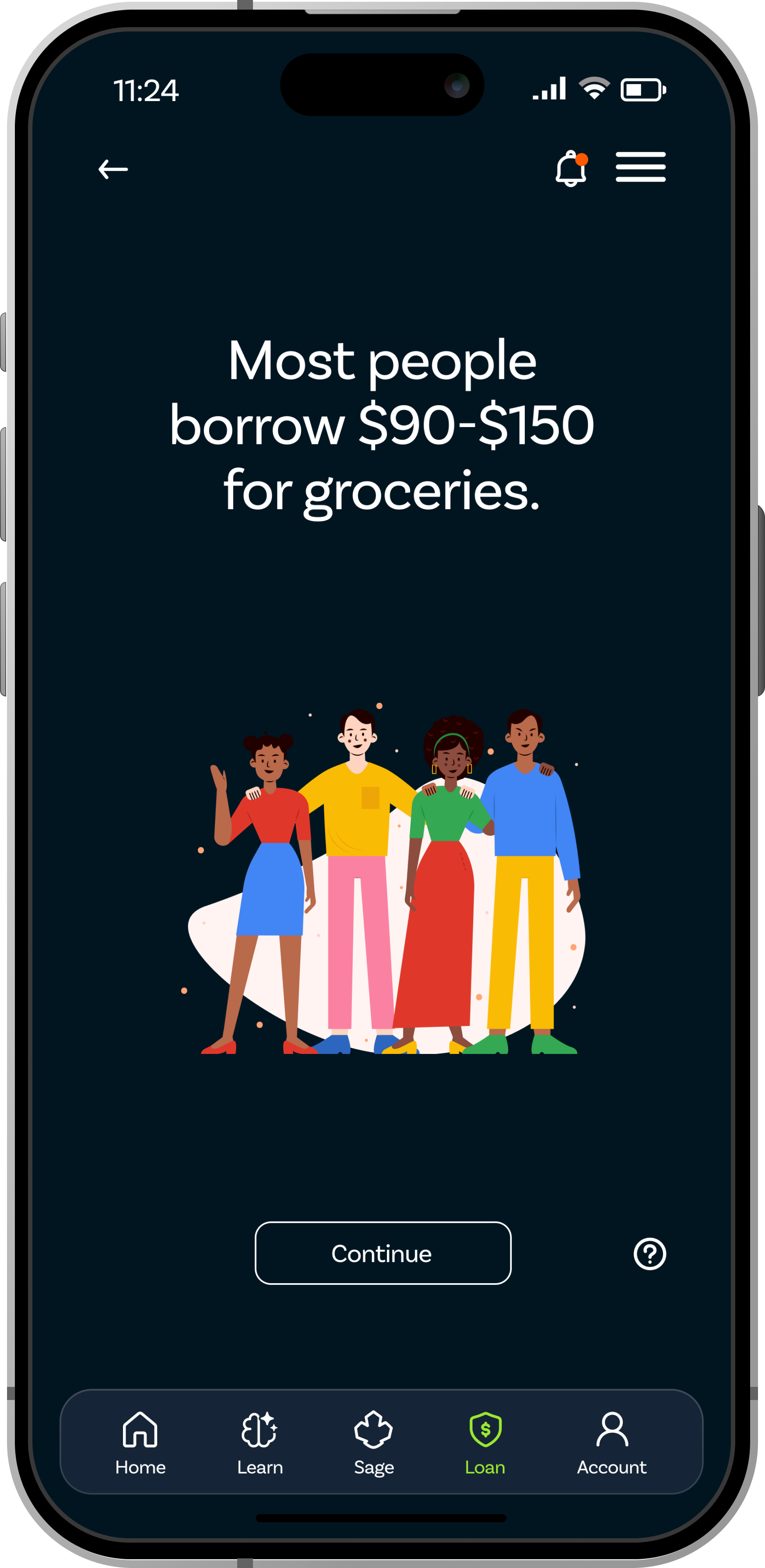
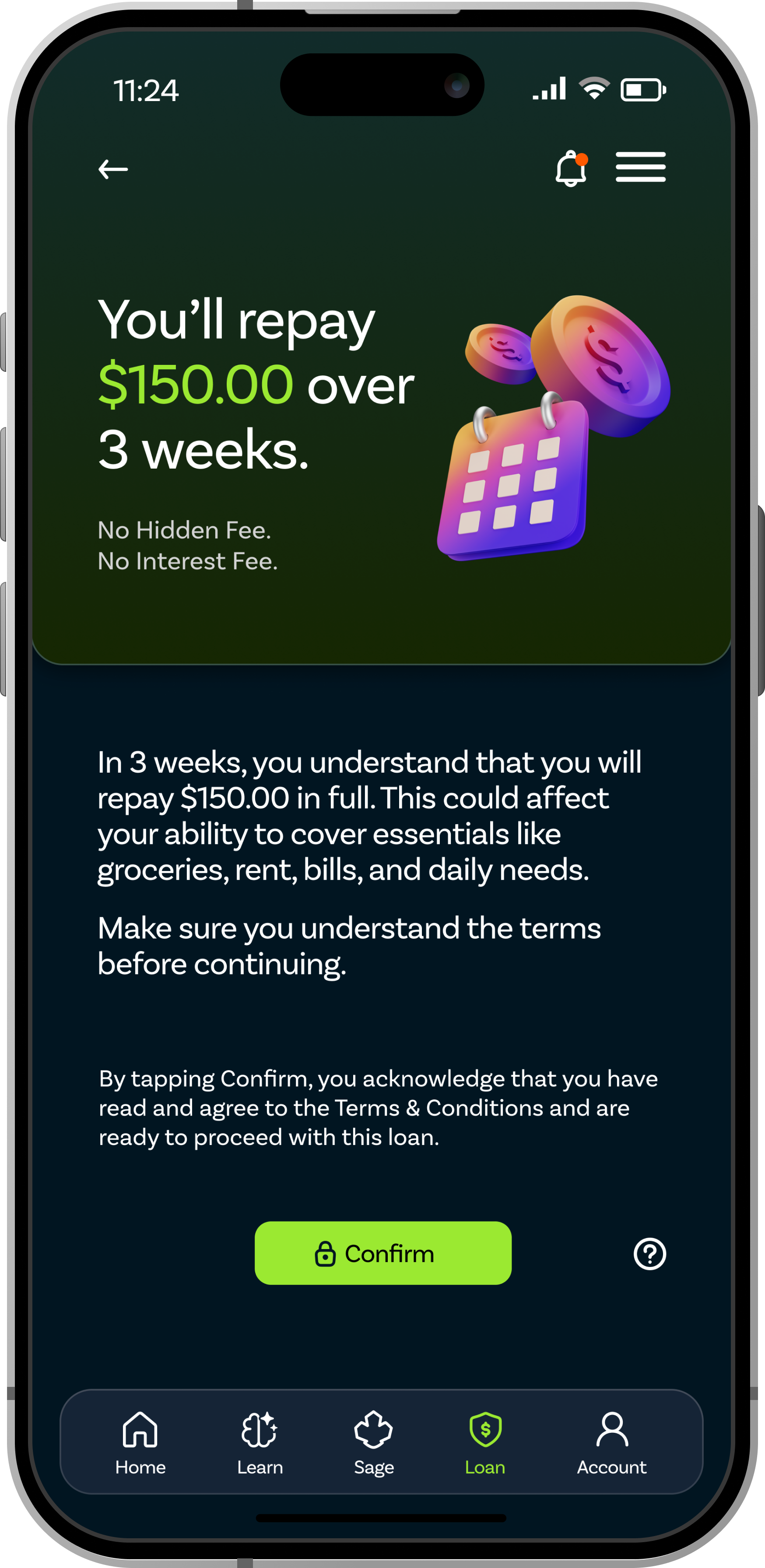
Safer alternatives. Transparent options.
Residents need safer alternatives to predatory lending and clearer ways to compare available financial options.
The marketplace allows users to explore loan opportunities, compare options, and learn eligibility requirements in a transparent way.
Helping users understand available options can reduce uncertainty and support more informed financial decisions.
Screens shown: Loan marketplace, loan details, repayment progress, payment options.
Design Evolution
How the product moved from rough structure to a calmer, more trusted experience.
SAGE went through several visual and structural changes before reaching the final design. The goal was to make the product feel less like a flashy fintech app and more like a calm, trusted financial support tool.
Logo Exploration
A mark built on clarity, trust, and scale.
The logo started with rough pencil sketches. I wanted to tailor it to D.C. itself, which led to the leaf symbol. Realizing shields represent unity and security, I combined both symbols. The final mark expresses unity, growth, community, and security.
As the product direction became clearer, the final logo moved toward a simpler symbol that felt more calm, trustworthy, and easier to recognize in a mobile app.
Early marks exploring growth, guidance, and community through rough gesture forms.
Refining toward trustworthiness and accessibility, moving away from abstract forms.
A formalized version that tested the mark for clarity across app contexts.
The final mark expresses unity, growth, community, and security.
The first wireframes focused on structure before visual design. At this stage, the main goal was to organize the experience around the user journey: learn, connect, take action, and track progress. Grayscale layouts helped test hierarchy without relying on color, while the card-based structure made complex financial information easier to scan.
Cross Section
Sage
Lessons
Microloan
Feedback → Design Changes
"It looks like Cash App."
Shifted the visual language away from transactional fintech patterns and toward a more supportive, community-centered experience.
Information felt overwhelming.
Reduced content density and grouped information into smaller, scannable sections.
Users wanted clearer next steps.
Added progress indicators, recommendations, and action-focused cards throughout the experience.
Community support was not obvious enough.
Increased visibility of local resources, workshops, and neighborhood-based assistance.
Final Screens
The finished product.
Every screen designed to feel trustworthy, accessible, and built for the people it serves. Organized by user flow.
Cross Section / Dashboard
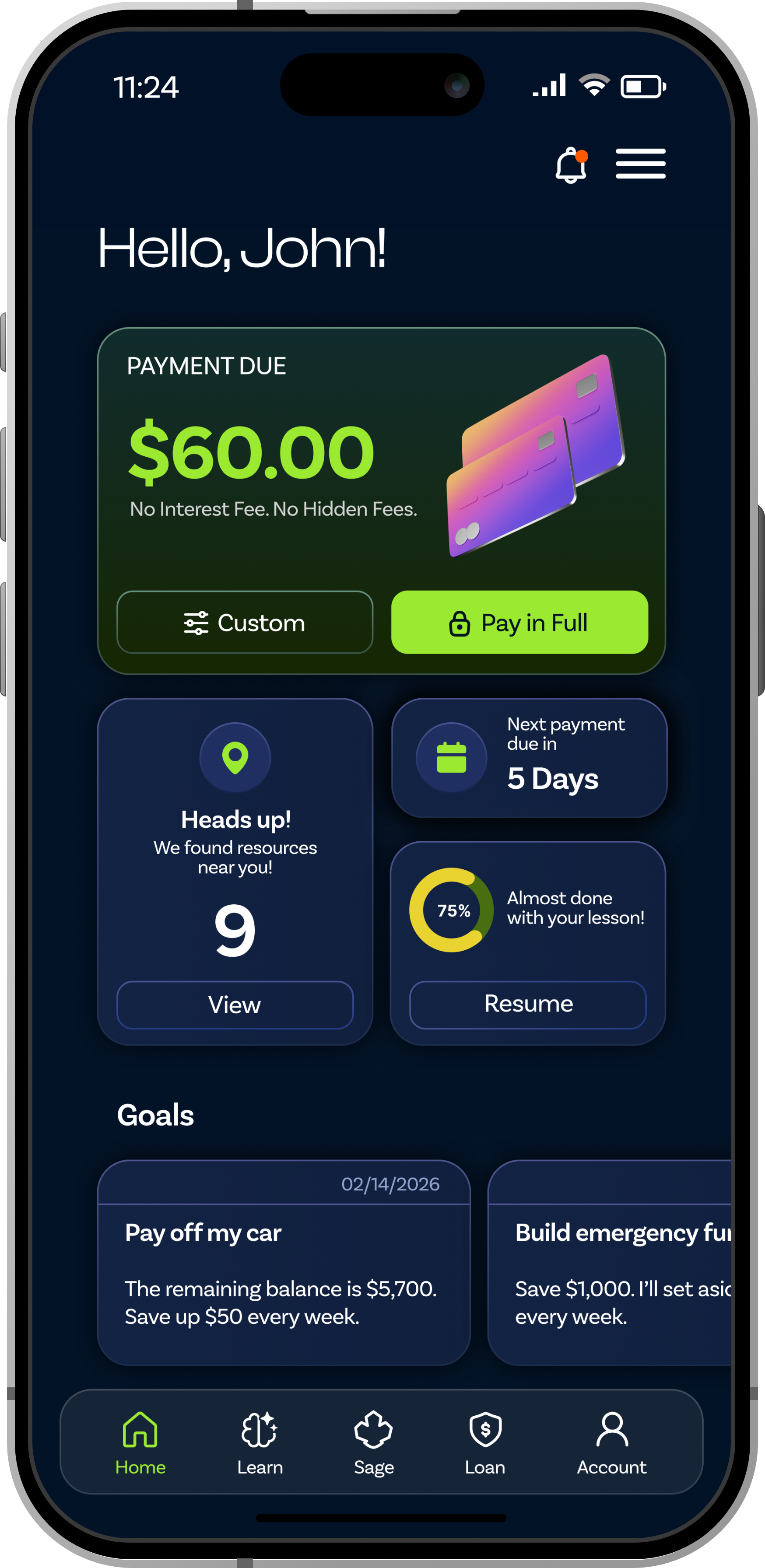

The dashboard shows what matters most right now: payments, goals, lessons, and nearby support. This gives users a clear starting point without making them search through the whole app.
Local resources are brought directly into the home screen. This makes support feel easier to find and less hidden.
Goals are broken into smaller steps so users can see progress over time. This helps big financial goals feel more manageable.
Lesson progress is visible on the dashboard to remind users of what they have already started. It encourages users to keep learning without feeling pressured.
Each card gives users a clear action (view, resume, or pay). This helps reduce confusion and makes the next step easier to take.
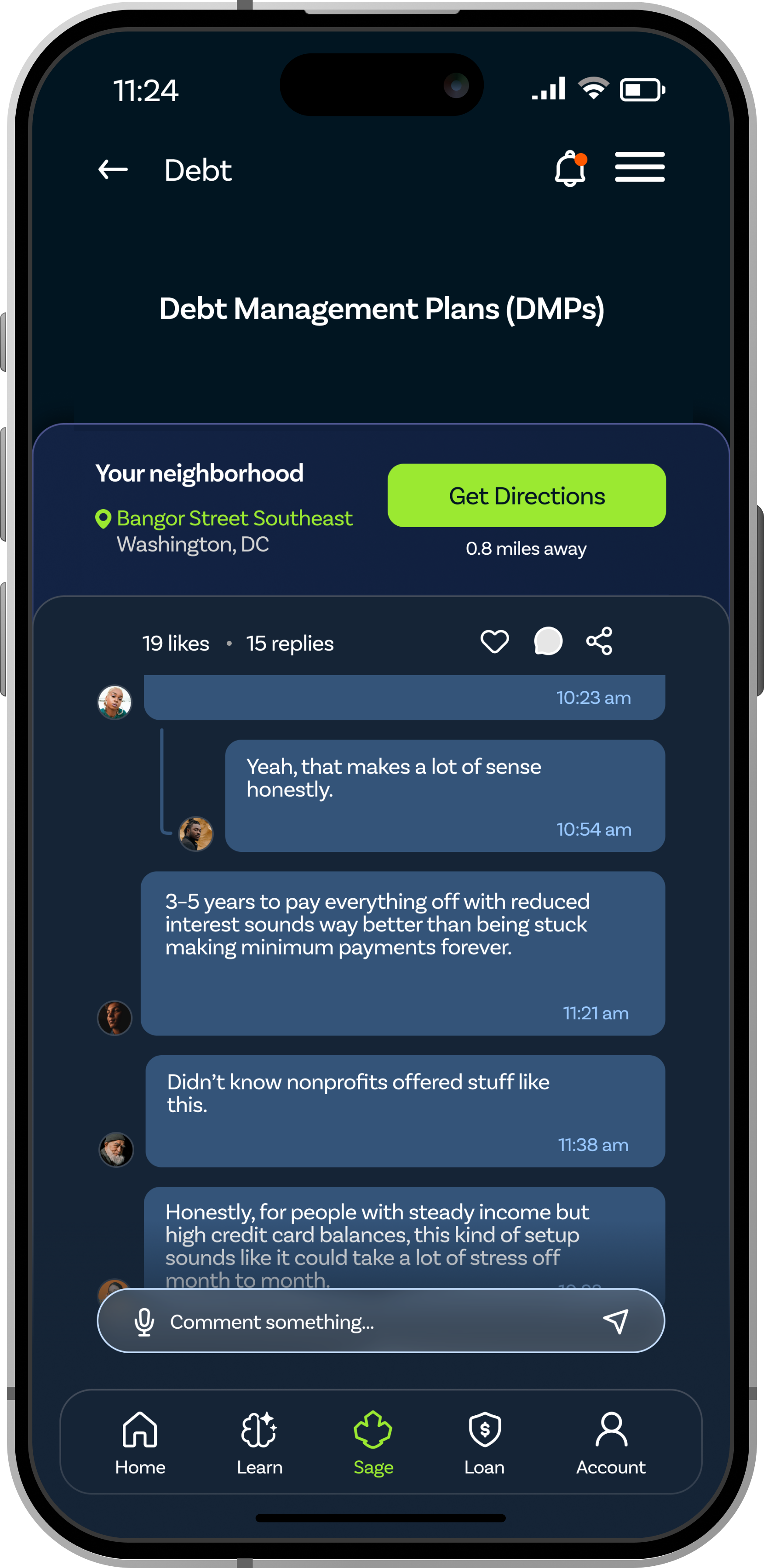
Community Hub
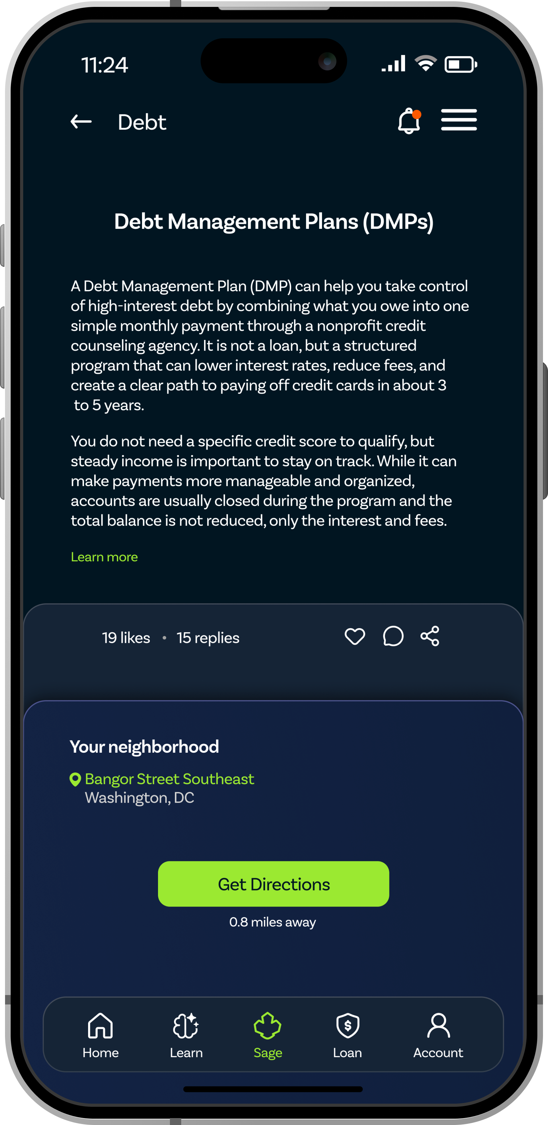
The map focuses on nearby help instead of generic resources. This makes support feel more real and reachable.
Common needs like debt, food, and rent are shown as quick-access categories. Users can find help faster without typing long searches.
Nearby help centers are shown clearly on the map. This helps users understand what support exists around them.
SAGE connects users to organizations and workshops, not just app features. This makes the product feel more human and community-based.
Short tips give users small pieces of guidance at the right moment. They keep the tone supportive without overwhelming the user.
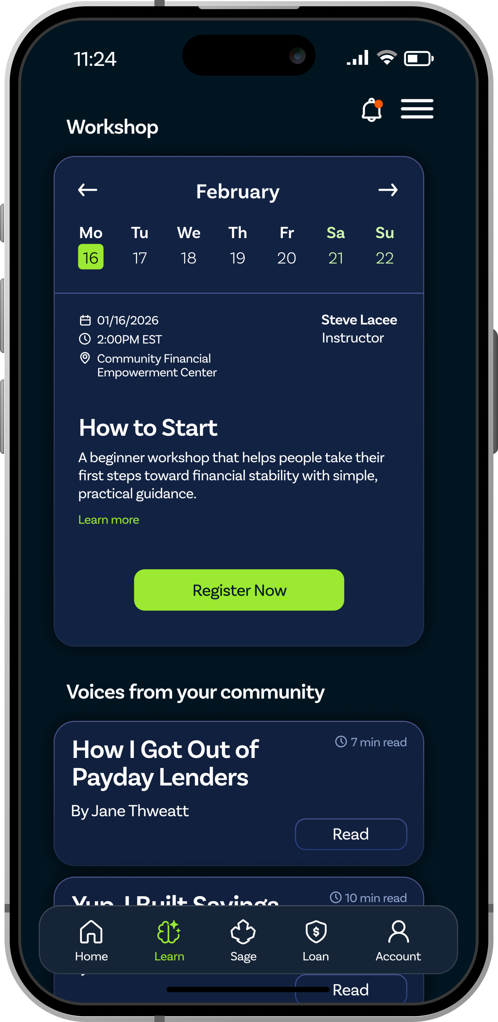
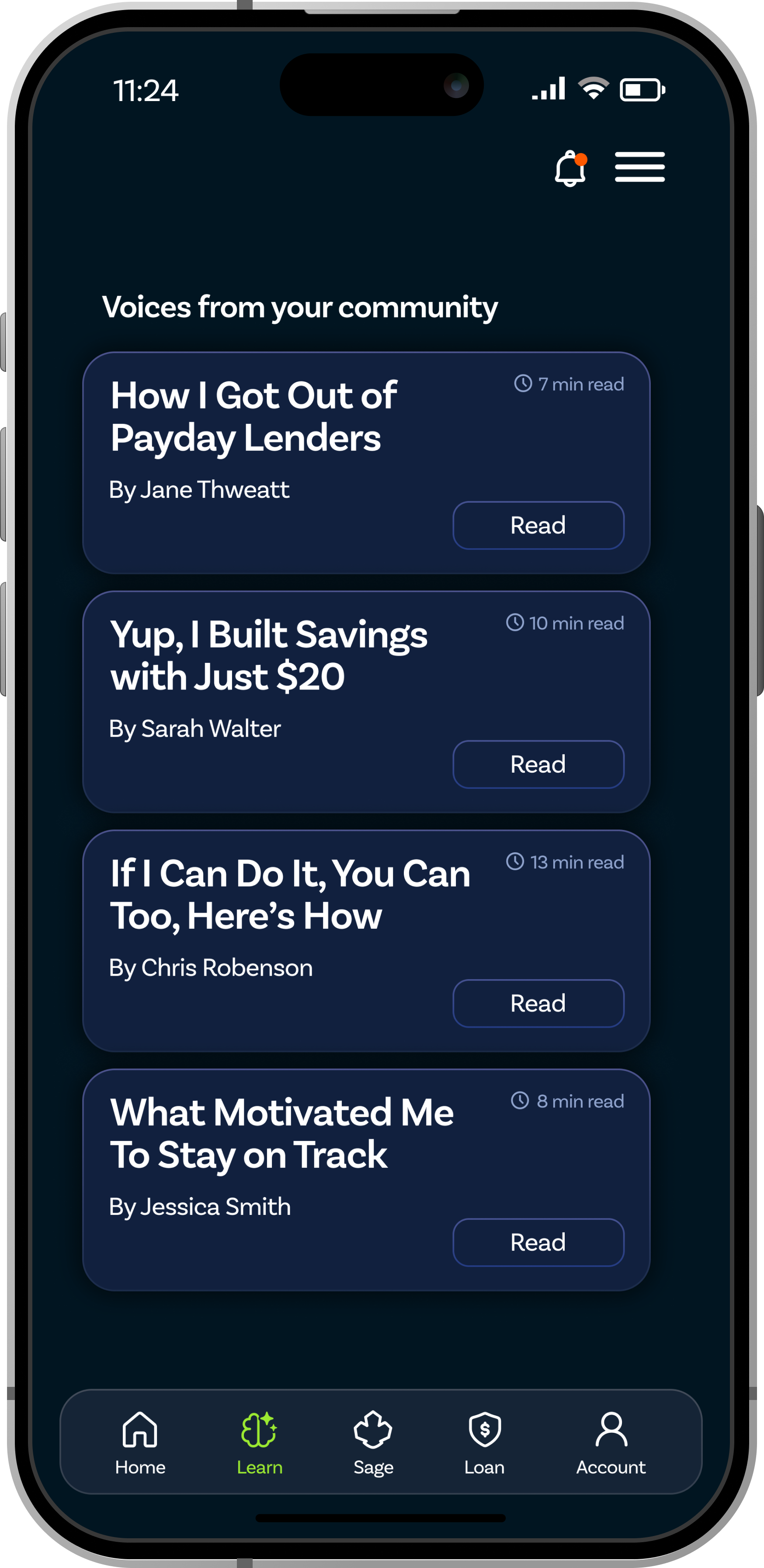
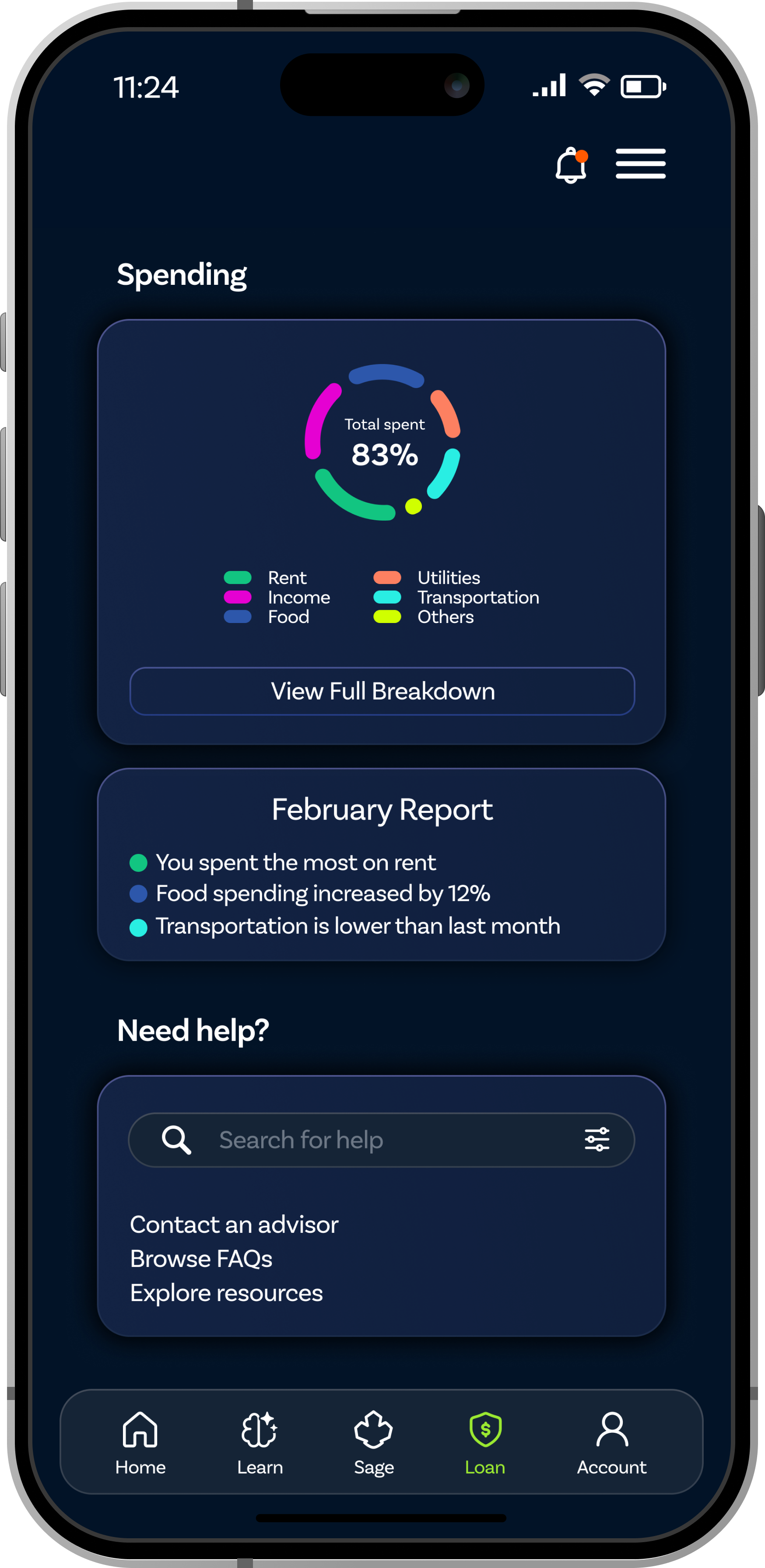
Financial Lessons
Lessons are grouped around real financial needs like credit, saving, and money management. This helps users find content that feels useful to their situation.
Financial topics are broken into smaller lessons instead of long explanations. This makes learning feel less overwhelming.
Progress bars show users how much they have completed. Small signs of progress can help users feel motivated to continue.
The Learn section also connects users to workshops, not just app lessons. This keeps financial learning tied to real people and local support.
Suggested lessons help users know where to start next. This makes the experience feel guided instead of leaving users to figure everything out alone.
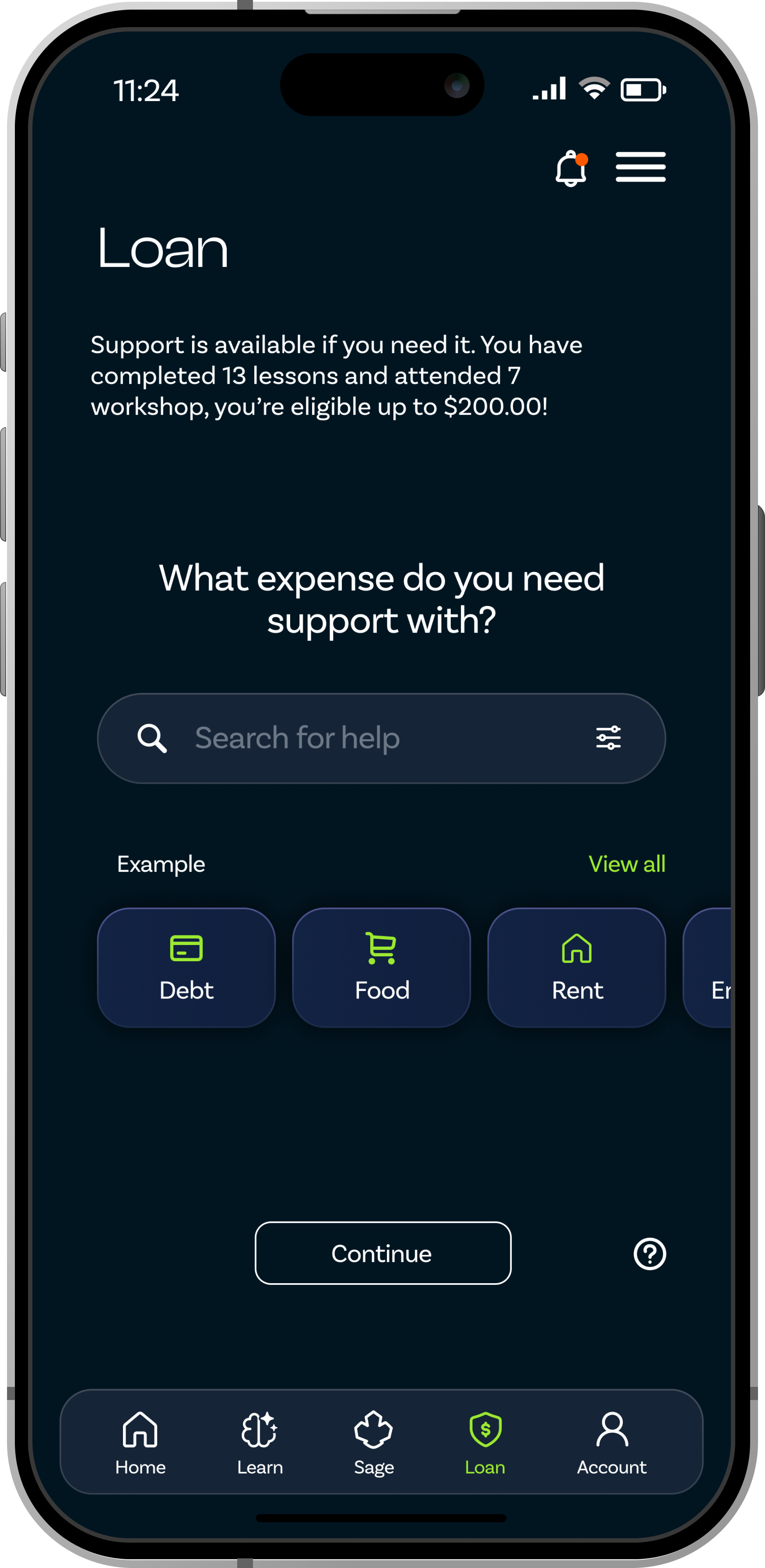
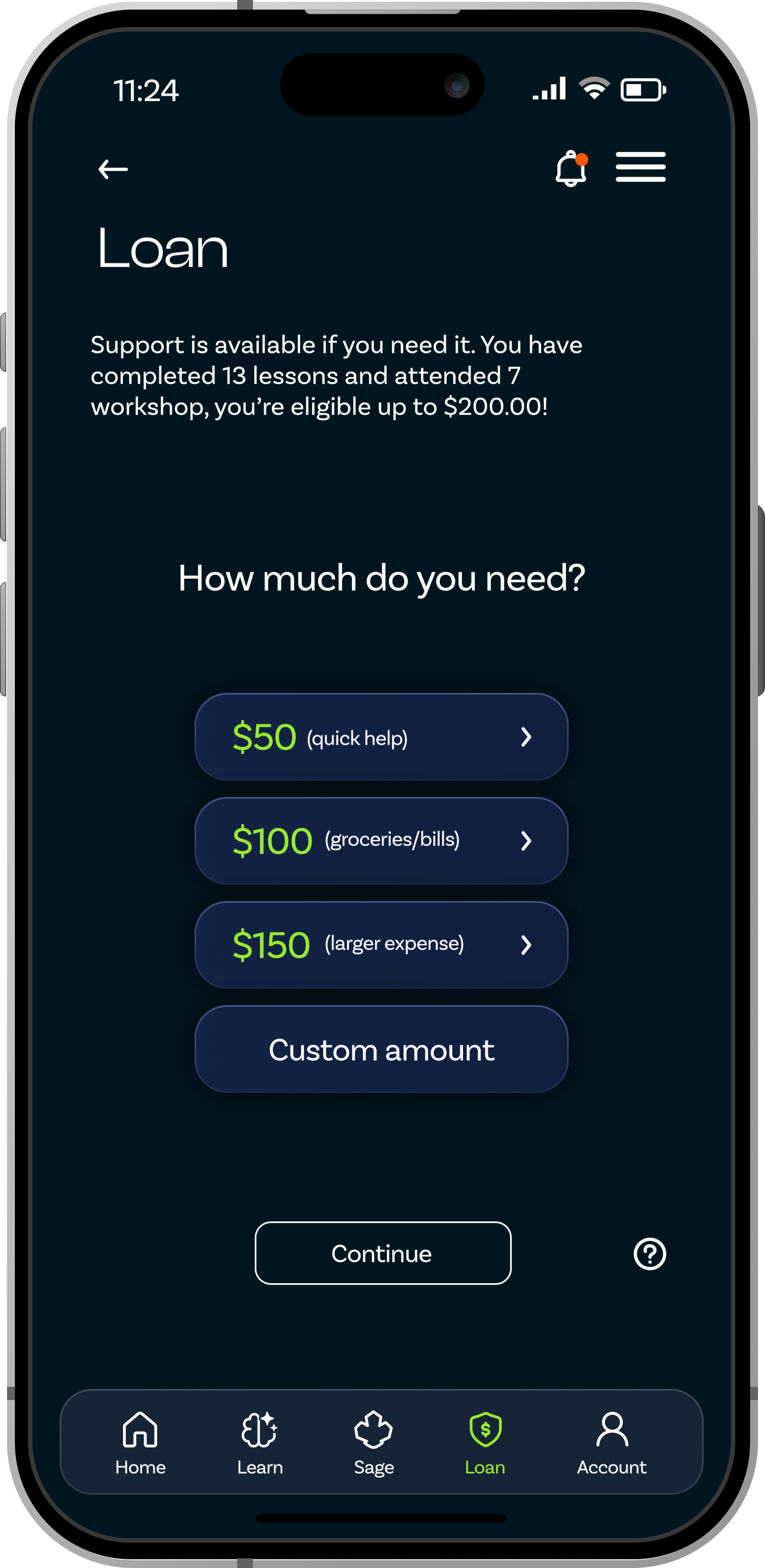
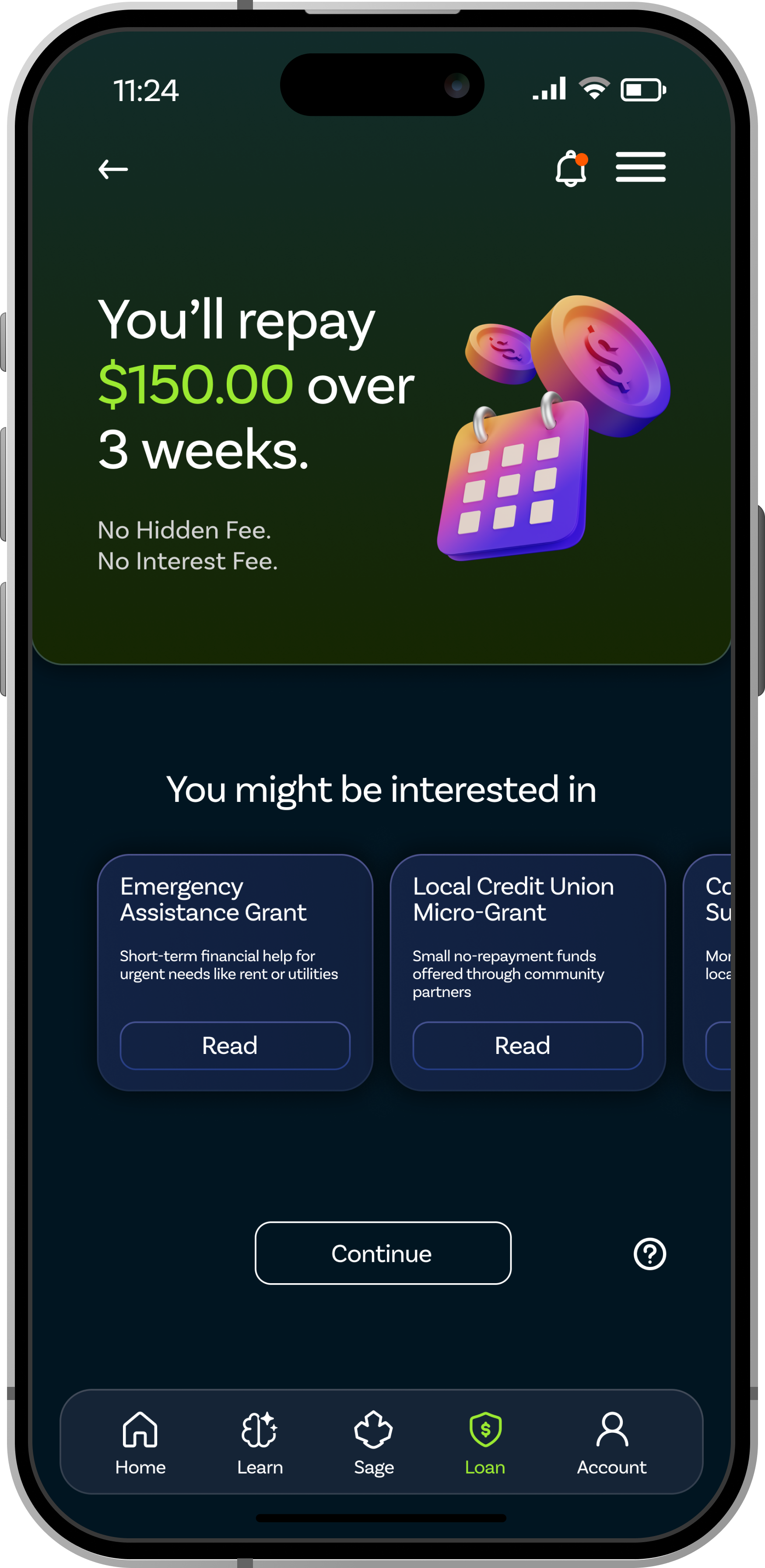
Microloan
The loan screen clearly shows the payment amount, due date, and remaining balance. This helps users understand where they stand before making a payment.
The repayment progress is shown in a simple, visual way. Users can quickly see how much they have paid and what is still left.
Upcoming due dates are placed in a clear card so they are hard to miss. This supports better planning and helps reduce missed payments.
Payment options are easy to access and not buried behind extra steps. This makes repayment feel more straightforward and less stressful.
Messages like "You're on track" help the experience feel supportive. The goal is to encourage users instead of making money management feel scary.
Interactive Prototype
Try it yourself.
Explore the full SAGE prototype. This interactive demo shows the core product flow including learning, resource discovery, and financial support.
Best viewed on desktop
Open the prototype in Figma to explore the full interactive flow on your device.
Open prototype in FigmaIf the prototype does not load, open it directly in Figma.
Open prototype in FigmaGWU NEXT Festival 2026
Presented at GWU NEXT.
SAGE was presented at the GWU NEXT Festival 2026, where students, faculty, and visitors explored thesis work focused on design, technology, and social impact.
Motion graphic created as a visual thesis demonstration for the GWU NEXT Festival 2026 at the Corcoran School of Arts and Design. This piece is a conceptual showcase, not a representation of the final product design.
Visual Guidelines
A system built for trust.
Every visual decision in SAGE reinforces the same goal: help residents feel safe, informed, and in control of their financial lives.
Color System
Typography
SAGE Financial
Used for headings, hero text, and key moments. Clash Display brings confidence and structure without feeling stiff.
Track your progress
Used for body copy, labels, and UI elements. Its clean legibility keeps the experience calm and easy to scan.
Design Intent
Dark navy palette and consistent layout patterns that feel stable and safe.
Short sentences, plain language, and scannable card layouts that reduce cognitive load.
High contrast ratios, generous touch targets, and clear focus states throughout.
Warm accents and human language that remind users this platform is built for them.
Validation / Feedback
Testing without metrics.
Because this was a solo thesis project, validation focused on qualitative feedback rather than business metrics.
What changed after feedback
The visual style became calmer and less like a typical fintech app, so the product felt more supportive than transactional.
The dashboard was redesigned to show the most important things first: payments, goals, lessons, and nearby resources.
Information was broken into smaller cards so users could scan the screen faster without feeling overwhelmed.
Learning progress and goal tracking became more visible to help users feel a sense of momentum.
Community resources were moved closer to the main experience, making local support easier to find and access.
Loan details were made clearer by showing payment status, due dates, and repayment options in a simple way.
The navigation was simplified so users could move between Home, Learn, Sage, Loan, and Account without confusion.
Reflection
What this project taught me.
This project taught me that designing for financial access is not just about creating tools. It is about understanding trust, fear, history, and the systems people are forced to navigate. SAGE pushed me to slow down, question my first ideas, and design with more care around what users need to feel informed, supported, and in control.
Design cannot solve systemic problems. It can dignify the entry point.
SAGE does not fix redlining. It does not rebuild the banks that were never built. What it can do is meet people where they are and provide a tool that does not make them feel small. That is a meaningful contribution, even if it is not a solution.
Trust is earned through consistency, not features.
Every interaction in SAGE is an opportunity to keep or lose trust. I learned to treat each screen as a promise. The most important design decisions were not what to add, but what to leave out.
Research methodology shapes what you find.
My initial research framed residents as victims of a broken system. When I reframed them as resourceful people navigating constraints, the design changed completely. The features that emerged from that reframe are more useful and more respectful.
What’s Next
If I took SAGE further.
Launch a small pilot with Ward 7 and 8 residents through trusted local organizations to evaluate how SAGE performs beyond a prototype, especially around trust, repeat use, financial confidence, and movement away from predatory lending.
Design the back-end community trust model that the microloan feature depends on, including how peer accountability scales as the user base grows.
Build an ongoing feedback loop with local organizations, counselors, and residents to keep improving SAGE around real community needs, not assumptions.