Editorial Design · SAGE Extension
SAGE Editorial
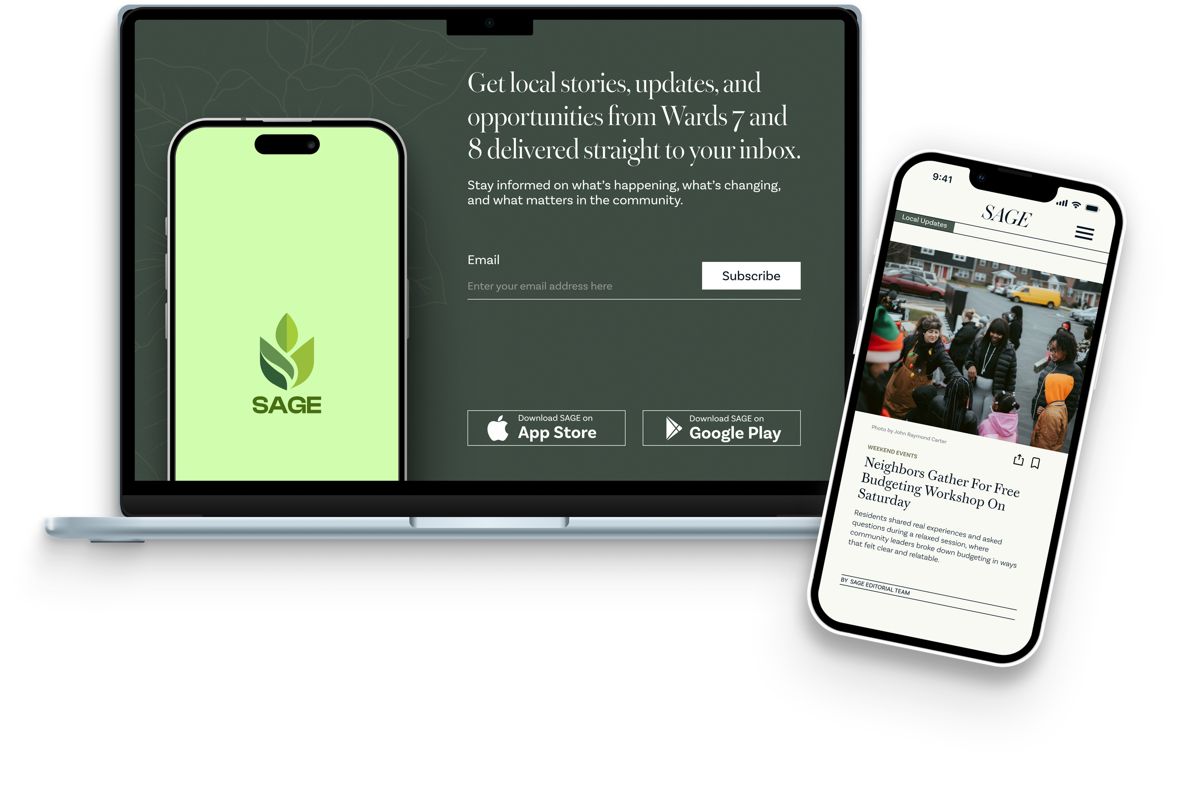
An editorial website extending SAGE into stories, updates, and lived experiences from Washington, D.C.'s Ward 7 and Ward 8 communities.
SAGE Editorial expands my thesis project into a content-driven platform that explores the everyday realities, overlooked stories, and community context surrounding financial access in D.C. Rather than presenting SAGE only as a product, this editorial extension creates space for narrative, local updates, cultural texture, and community-centered storytelling.
Context
Why an Editorial Extension?
SAGE started as a banking access tool for D.C.'s Ward 7 and Ward 8, designed around the communities that predatory lenders had targeted for decades. For this editorial project, I wanted to extend that system beyond product features and into storytelling.
The editorial site became a space for local stories, daily decisions, community updates, and the financial realities that shape life in Ward 7 and Ward 8. It creates a more familiar entry point into the same themes SAGE addresses: trust, access, and the kind of financial knowledge that doesn't travel through bank brochures.
The goal was not to make the site feel like a corporate resource hub. The goal was to make it feel like a familiar publication: with structure, warmth, and a clear editorial voice.
Assignment Frame
The editorial course became a reason to ask a different question: what does SAGE look like when it's not selling something? The deliverable was a multi-page digital publication. The real challenge was making financial life feel human enough that someone would actually read it. Grid systems, typesetting, hierarchy, and editorial voice all in service of that.
Direction
Editorial Direction
I focused on making the site feel familiar by borrowing cues from newspaper and magazine layouts while still keeping the experience clear, structured, and trustworthy. Since SAGE deals with serious topics like financial access, trust, and community resources, the editorial direction needed to balance warmth with credibility.
Familiarity through editorial cues
Newspaper-like structures, article blocks, section hierarchy, and strong grids help the experience feel familiar and readable, drawing on what readers already know.
Trust through structure
Clear spacing, organized layouts, and consistent content patterns make the site feel reliable without becoming cold or institutional.
Community through storytelling
The editorial format creates room for stories, updates, and lived experiences that a product interface alone cannot fully express.
A softer SAGE identity
The color system takes inspiration from SAGE but uses muted editorial tones to create a distinct publication personality that still feels connected to the same design world.
Visual References
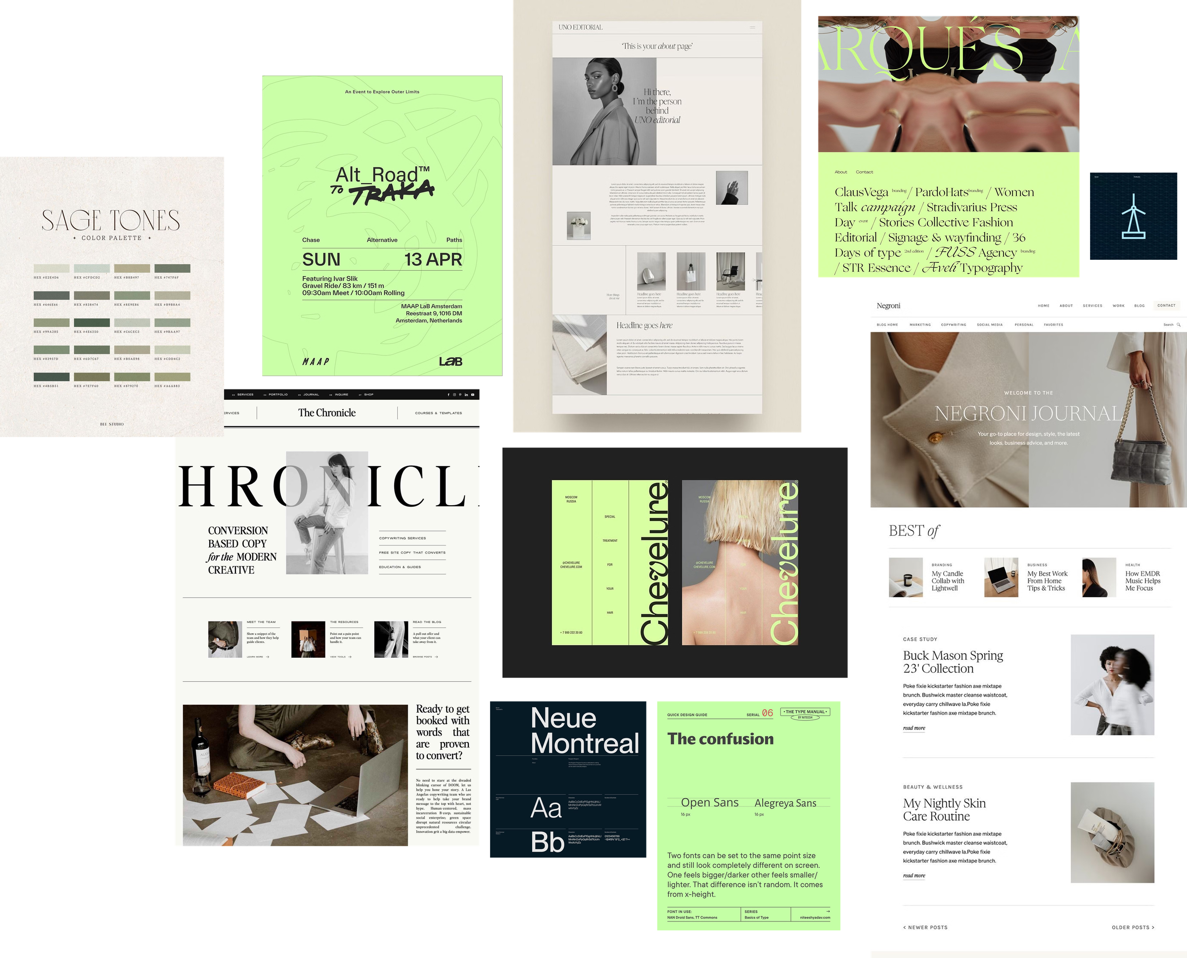
Moodboard and Visual References
The moodboard helped define the editorial tone of the site: structured, calm, readable, and publication-driven. I looked at newspaper layouts, fashion editorials, magazine-style grids, muted color systems, and expressive typography to shape a site that felt familiar but still distinct from the main SAGE app.
Visual System
Visual Guidelines
The original SAGE app palette used a brighter green accent, but the editorial site needed a softer and more publication-driven tone. I shifted the palette toward muted sage and olive-gray values so the editorial experience could feel trustworthy, calm, and distinct while still staying connected to SAGE.
App Color Palette
Editorial Site Color Palette
Typography
Community Stories, Told Clearly.
Warbler is used for expressive editorial headlines and section titles, bringing a publication quality and warmth to the reading experience.
Access. Trust. Community. These are not abstract ideas. They are daily realities for Ward 7 and Ward 8 residents navigating financial life.
Money · Housing · Community · Resources
Basic Sans handles body copy, navigation, labels, and all supporting text, keeping the reading experience clean and accessible.
Progress
Lo-fi Sketches and Layout Exploration
For SAGE Editorial, the lo-fi stage is less about app functionality and more about building a reading system. Since this project extends SAGE into stories, updates, and community context, the early sketches needed to answer a different question: not "what can users do here?" but "how should people move through information in a way that feels trustworthy, local, and easy to read?" The goal was to shape a publication experience that could carry serious topics like financial access, community resources, and Ward 7 and Ward 8 stories without feeling like a corporate resource page.
Lo-fi Sketches
At this stage, I focused on creating the structure of the editorial site before making visual decisions. I treated the page like a publication system, not a landing page. That meant thinking about rhythm, section order, article hierarchy, and how different types of content could sit together without overwhelming the reader.
Low to Medium Fidelity Figma Exploration
What this phase validated
The main validation for this phase is that the sketches gave the project an editorial backbone. They helped define how SAGE could expand beyond a financial tool and become a storytelling platform. Before color, typography, or polished mockups, the structure needed to prove that the content could feel organized, credible, and community-centered.
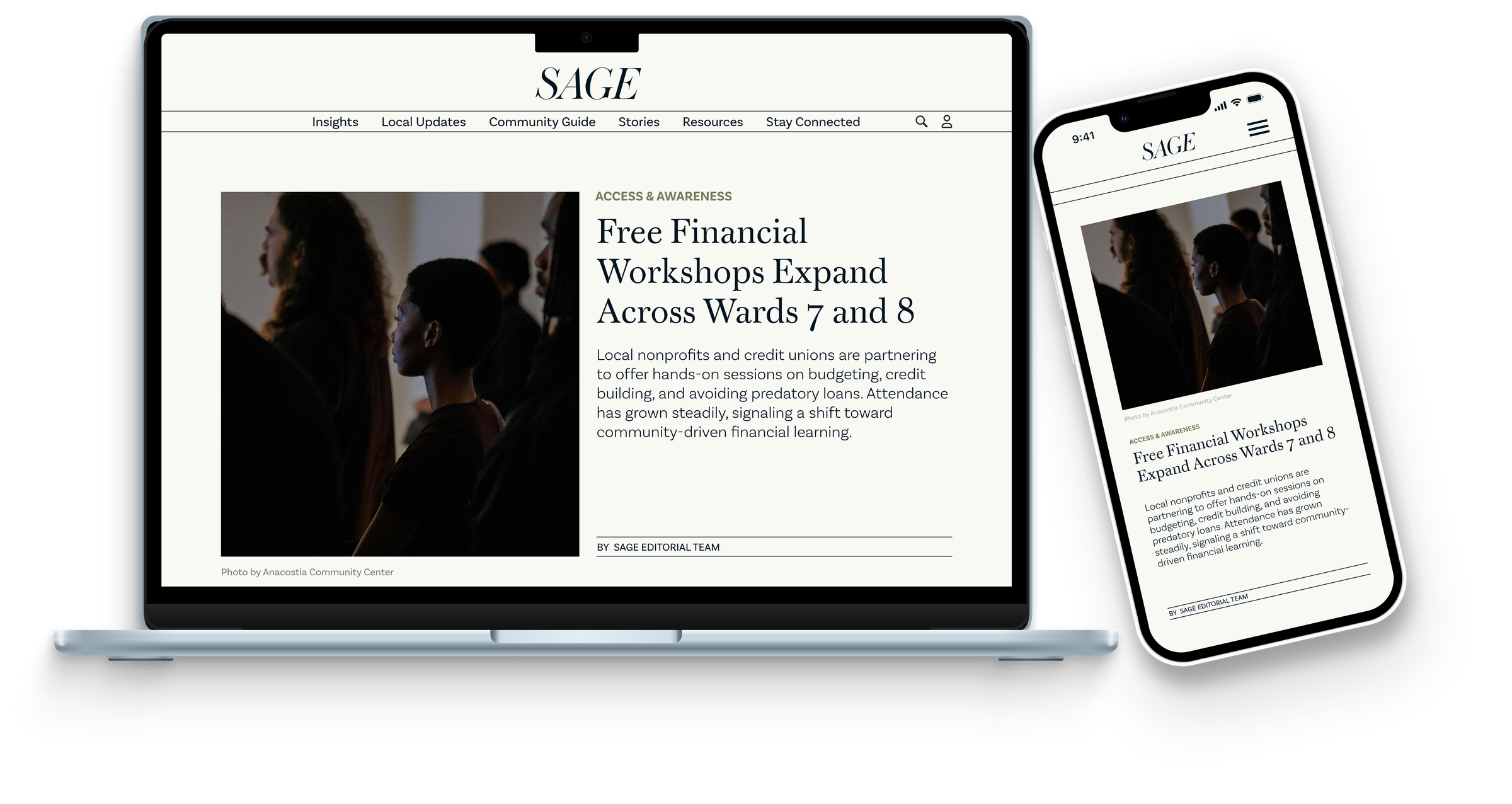
Final Design
Final Design
The final design resolves every direction decision into concrete editorial choices. Structured article sections establish reading rhythm and signal to users that content is organized, not overwhelming. The muted sage palette deliberately steps back from the app's brighter accent: a publication earns trust through restraint, not energy. Expressive serif headlines carry the warmth and credibility that SAGE's communities need to feel like this publication was made for them, not distributed to them.
Final High-Fidelity Figma File
Interactive Prototype
Explore the final SAGE Editorial prototype and page flow.
Reflection
Reflection
This project helped me think about SAGE beyond the boundaries of an app interface. Designing an editorial extension meant stepping into a different kind of design problem: the primary challenge was not feature layout or interaction state, but rather how to make content feel trustworthy, readable, and genuinely connected to a community.
Working within an existing design system while developing a separate publication identity required careful judgment about what to borrow, what to soften, and what to leave behind. The editorial site needed to feel like it belonged to the same world as SAGE without feeling like a duplicate of it.
Design beyond the product
Thinking about SAGE as a broader ecosystem (not just an app) pushed me to consider how editorial design, storytelling, and information architecture can serve the same mission differently.
Editorial structure as UX
Strong grid systems, hierarchy, and reading flow are not just aesthetic choices. They are UX decisions that shape how readers trust, engage with, and move through content.
Color adaptation
Adapting the SAGE palette rather than copying it taught me how to maintain brand continuity while developing a distinct visual identity for a different product context.
Designing editorial content is not just about layout. It is about how structure communicates trust, and how a publication can carry forward the same mission as a product, just in a different register.
Next Steps
If I Were to Continue
The editorial site as designed is a strong visual and structural foundation. If this project were to move toward a live product, these are the next areas I would focus on to deepen both the design system and its real-world usability.
Prototype key interactions
Build interactive Figma prototypes for the newsletter signup flow, article navigation, and section filtering to demonstrate how the editorial site would behave as a live product.
Expand the article system
Design additional article templates (long-form features, resource roundups, and community spotlights) to show how the editorial grid adapts to different content types.
Develop the mobile experience
Refine the mobile breakpoints with more detail: gesture interactions, bottom navigation patterns, and reading-mode optimizations for smaller screens.
Test with real readers
Run usability sessions with Ward 7 and Ward 8 community members to evaluate whether the editorial structure, hierarchy, and tone feel genuinely accessible and trustworthy.
Connect editorial content to app features
Map specific article types to SAGE app features. For example, a story about local credit unions could link directly to the app's credit union finder, creating a seamless bridge between reading and action.