UX Case Study
GW Ride
A mobile shuttle and campus discovery app for George Washington University students
Exploring how real-time shuttle tracking, clearer stop information, and nearby place discovery can help students move around campus with more confidence and less confusion.
Project Snapshot
A campus transit experience built around student confidence.
UX Designer + UX Researcher
Spring 2024
Mobile
Figma
User research, competitive analysis, journey mapping, wireframing, prototyping
Campus transportation, real-time tracking, wayfinding, student mobility, nearby discovery
Designed a mobile prototype with four core features: shuttle tracking, route visibility, stop information, and Explore.
GW RIDE is a mobile shuttle and campus discovery app designed for George Washington University students who rely on campus transportation to move between classes, residence halls, and nearby campus areas.
The project explores how real-time shuttle tracking, clearer stop information, and nearby place discovery can help students move around campus with more confidence and less confusion.
Problem / Context
Campus Transit Should Feel Clear, Not Uncertain
GW students often move between different parts of campus (classes, housing, dining, study spaces, and nearby places). When shuttle locations, arrival times, and stops are unclear, students have to guess whether to wait, walk, or find another option.
The question we avoided
“How might we make another transit app?”
Generic transit features (maps, timetables, route lists) exist already. Building another one wouldn’t help students make better decisions on campus.
The real challenge
“How might we help students quickly understand where the shuttle is, where it goes, and what nearby places they can access around campus?”
The design challenge was about clarity, confidence, and campus-connected mobility. Giving students enough information to make a fast, low-stress decision.
Design Principles
Four ideas that shaped every design decision.
Reduce Waiting Uncertainty
Students should know where the shuttle is and when it is expected to arrive. Uncertainty about timing is the main reason students choose rideshares instead.
Make Routes Easy to Understand
Routes, stops, and destinations should be simple to scan without needing extra explanation. A student should be able to understand the shuttle system in seconds.
Support Campus Life Beyond Transportation
The app should help students not only move around campus, but also discover nearby places that support their daily routines: food, study spots, services.
Keep Decisions Quick
Students often check transit information while walking, rushing to class, or deciding whether to wait. The experience should be fast and easy to understand at a glance.
Research Approach
Understanding what students actually need at the moment of decision.
Research focused on understanding how students navigate GW’s campus transportation, what makes the shuttle experience frustrating, and what information students need before deciding to wait or walk.
Research Methods
Purpose: Understand how students use the shuttle and what makes the experience difficult.
Revealed: Students wanted faster access to arrival times, stop locations, and route information.
Purpose: Observe how students move around campus and interact with shuttle stops.
Revealed: Students often had to make quick decisions with limited information available at stops.
Purpose: Review how transit and map-based apps communicate movement, nearby places, and route details.
Revealed: Real-time tracking, clear stop details, and simple map interactions were important patterns to include.
Purpose: Understand the shuttle experience before, during, and after a ride.
Revealed: The biggest pain point was not only waiting, but not knowing whether waiting was worth it.
Observation in the Field
Campus transit observation documented how students interact with shuttle stops, make wait-or-walk decisions, and navigate GW’s transportation network in real conditions.
Field documentation from the campus transit observation study. Photos capture student behavior, stop conditions, and transportation patterns across GW’s campus.
Key Insights
Three patterns that shaped the design direction.
Uncertainty Creates Friction
Real-time shuttle tracking was made central to the experience so students can quickly decide whether to wait or walk.
Stops Need Better Visibility
Stop information and route details were brought into the main flow so users do not have to search for basic transit details.
Campus Movement Is Also Campus Discovery
The Explore feature helps students find nearby places around campus, making the app useful even beyond shuttle tracking.
Bus Route Proposal
Expanding coverage to better serve students.
The revised route proposal expanded coverage so it became more convenient for students and more efficient for getting from point A to point B on campus. The maps below show the difference between the existing routes and the proposed improvement.
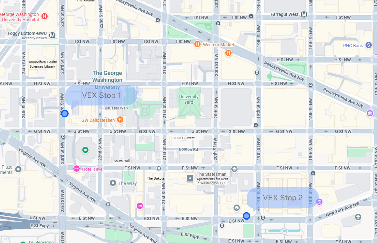
Existing campus shuttle routes and stop coverage.
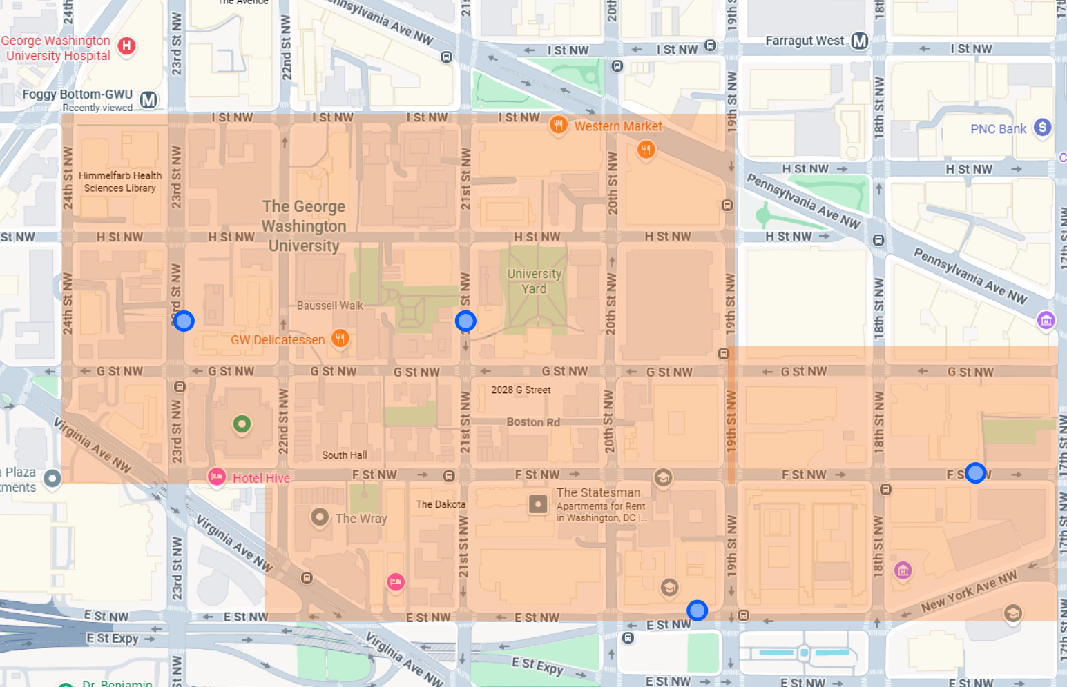
Proposed route expansion with improved coverage and student-centered stop placement.
User Journey / Core Flow
From uncertainty to a confident campus commute.
Students needed an experience that could answer quick questions in the moment: Where is the shuttle? When will it arrive? Where does it stop? What is nearby? The core flow was designed to answer all four with as few taps as possible.
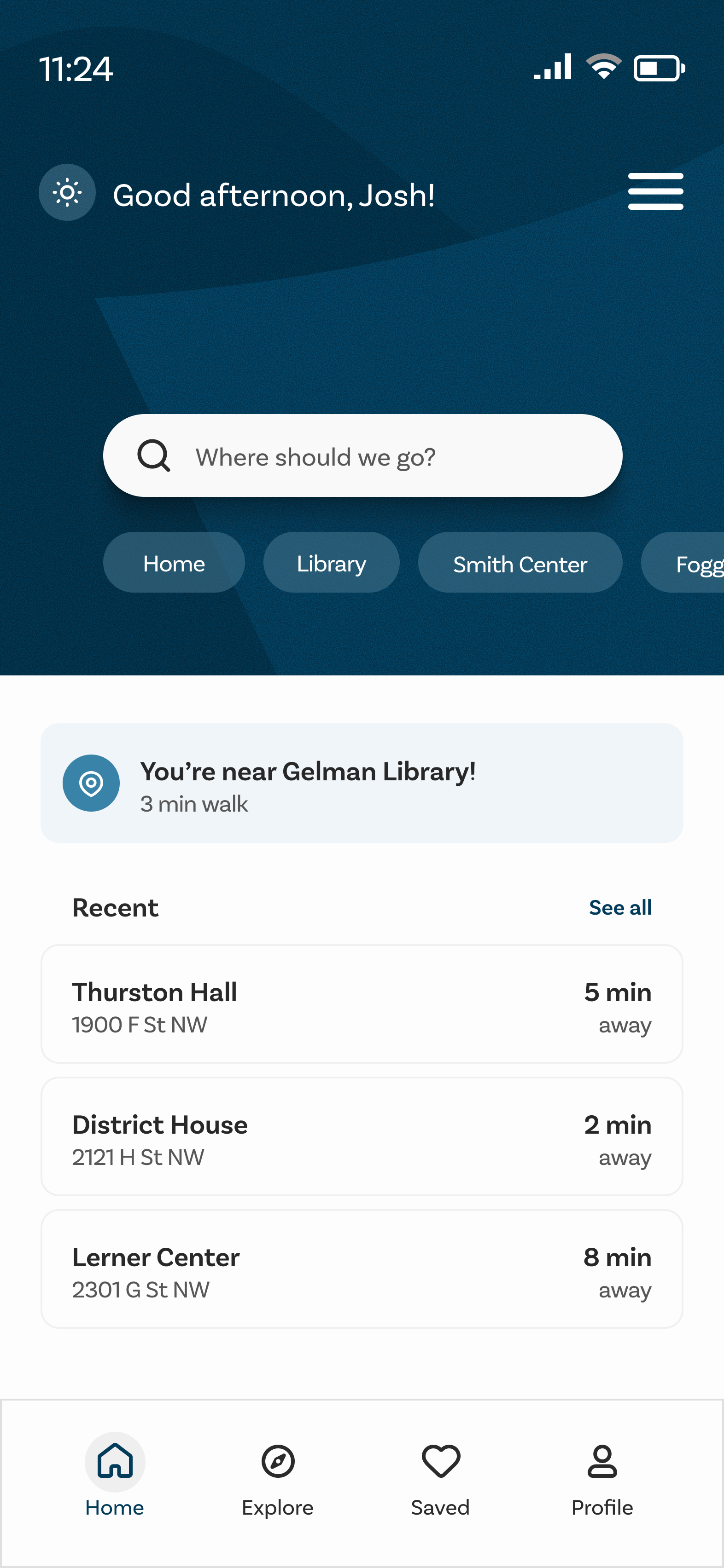
Open App
Student launches GW Ride to check shuttle status.
View Shuttle Location
Live shuttle position and arrival time appear immediately.
Check Stop / Route Details
Student confirms the route covers where they need to go.
Decide to Wait or Walk
With clear timing, the decision takes seconds, not guesswork.
Explore Nearby Places
Between trips, students discover food, study spots, and campus services.
Questions the experience answers
Live location on the main screen.
ETA visible without any extra taps.
Route and stop details one tap away.
Explore surfaces places while students wait.
Feature Breakdown
Four features, each designed to answer a specific student need.
Every feature in GW Ride was shaped by a real friction point: students missing shuttles, misunderstanding routes, or not knowing what was nearby. Each decision traced back to what students actually needed in that moment.
Real-Time Shuttle Tracking
User Need
Students need to know where the shuttle is before deciding whether to wait or walk.
Design Decision
The app shows shuttle location and arrival information clearly from the main experience. No searching required.
Why It Matters
This helps reduce uncertainty and gives students more control over their time. Knowing the shuttle is 3 minutes away changes the decision entirely.
Route Visibility
User Need
Students need to understand where the shuttle goes and which stops are part of the route.
Design Decision
Routes are displayed with clear stop information and destination context so students can scan the full path at a glance.
Why It Matters
Students can quickly see whether the shuttle supports where they need to go, without opening a separate map or asking someone.
Stop Information
User Need
Students need to find nearby stops and understand when shuttles are arriving.
Design Decision
Stop details include location, route coverage, and arrival information in one place, accessible in two taps from the home screen.
Why It Matters
This makes the shuttle system easier to use, especially for students who are new to campus or unfamiliar with a particular route.
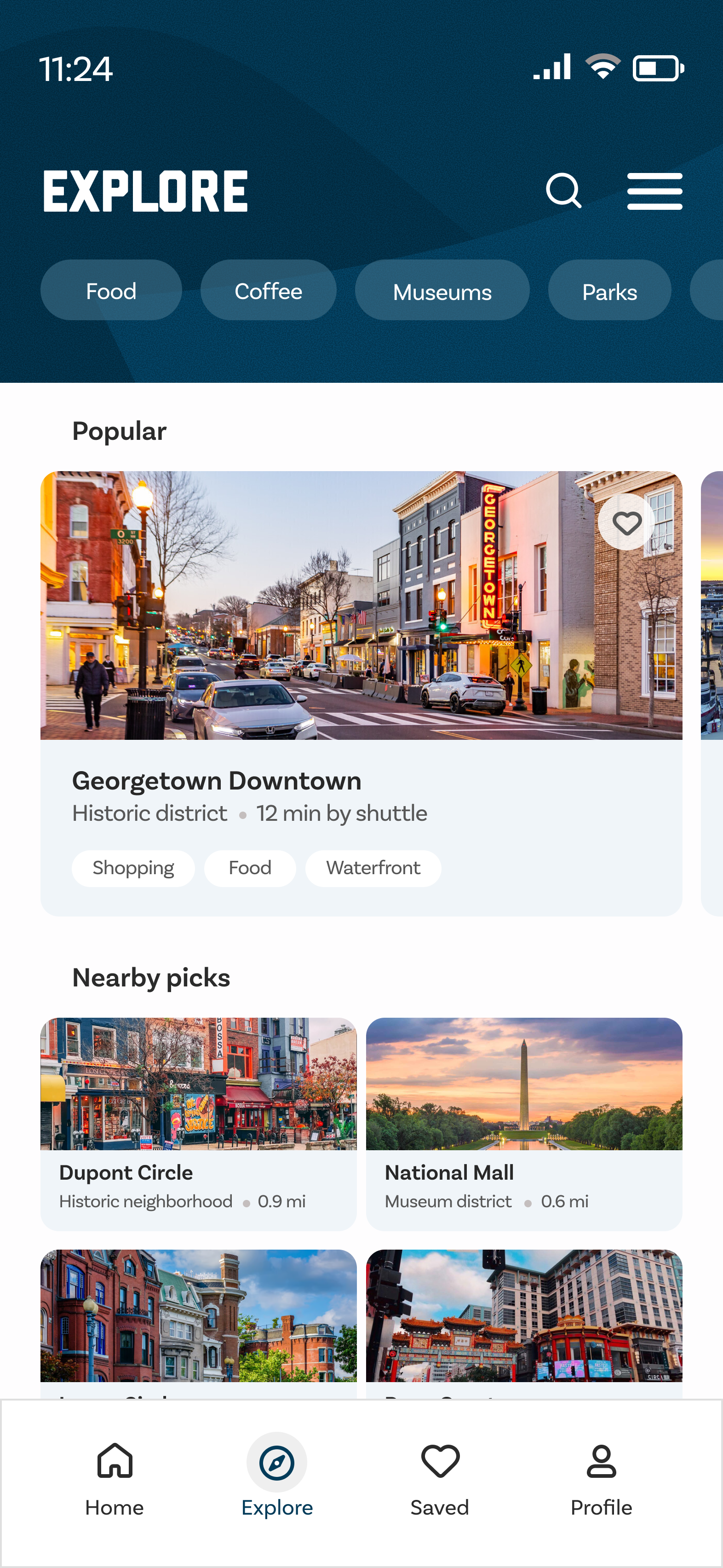
Explore
User Need
Students need a simple way to discover nearby places around campus: food, study spots, services, and useful locations.
Design Decision
The Explore feature highlights nearby places so students can connect transportation with campus life, not just transit stops.
Why It Matters
GW Ride becomes more than a shuttle tracker. It helps students understand what is around them and make better use of campus and nearby areas while they wait.
Design Evolution
From rough structure to a focused, confident experience.
The design moved through five phases: early sketches to test the concept, low-fidelity wireframes to establish structure, an initial prototype with real content, iterated prototype screens, and a final prototype that resolved the full experience.
Early concepts focused on showing shuttle and route information clearly. Paper sketches helped explore the core problem before any digital tools were opened: how should timing, routes, and stops be organized so students could make a decision in seconds?
What changed most between iterations: The prototype revealed that students scanned for ETA first, route name second, and stop detail last. The revised screens were reorganized around that scanning order, making the single most important number (minutes until arrival) the largest, most immediate element on every key screen.
Visual Guidelines
Typography and color system established for GW Ride.
Typography
1 2 3 4 5 6 7 8 9 0
Used for labels, ETAs, stop names
Color System
Final Screens
A polished campus transit experience built around student confidence.
The final design gives students the right information at the right time: where the shuttle is, when it arrives, what route it follows, and what is nearby. Four core flows, each designed to answer a specific question students have on campus.
Click any screen to expand
Interactive Prototype
Explore the full flow
This interactive demo shows the core app flow: onboarding, route discovery, shuttle information, and campus exploration.
Best viewed on desktop
Open the prototype in Figma to explore the full interactive flow.
Open prototype in FigmaIf the prototype does not load, open it directly in Figma.
Open prototype in FigmaValidation / Feedback
Feedback that shaped the final experience.
Because this was a student design project for a university proposal, validation focused on qualitative feedback rather than business or shipped metrics.
What Changed After Feedback
Real-time shuttle tracking became more visible and immediately accessible from the home screen.
Route and stop information was simplified so students could scan it faster without reading every detail.
The experience shifted from only transportation to transportation plus nearby discovery.
Explore was added to support students outside of the active shuttle flow.
The interface was refined to help students make quick decisions while moving around campus.
Reflection
What I Learned
This project taught me that campus transportation is not only about getting from one stop to another. It is also about reducing uncertainty, helping students feel oriented, and making the surrounding campus easier to understand.
Designing GW Ride taught me that transportation UX is fundamentally about reducing anxiety, not adding features. Students don’t want more information. They want the right information at the right moment. The most valuable insight was how much cognitive load unclear transit data creates.
This project also showed me how visual hierarchy functions as a tool, not just an aesthetic choice. Every decision (type scale, information density, color contrast) was in direct service of helping someone make a faster, more confident decision in a genuinely pressure-filled moment.
Next Steps
If development were to continue.
Test the prototype with more GW students during actual commute moments on campus.
Explore live shuttle data integration by partnering with GW Transportation.
Refine the Explore feature with better place categories and campus-specific context.
Add accessibility details for stops and routes: physical access, covered waiting areas.
Evaluate push notifications for shuttle arrivals, delays, and route changes.